Brand Strategy, Visual identity
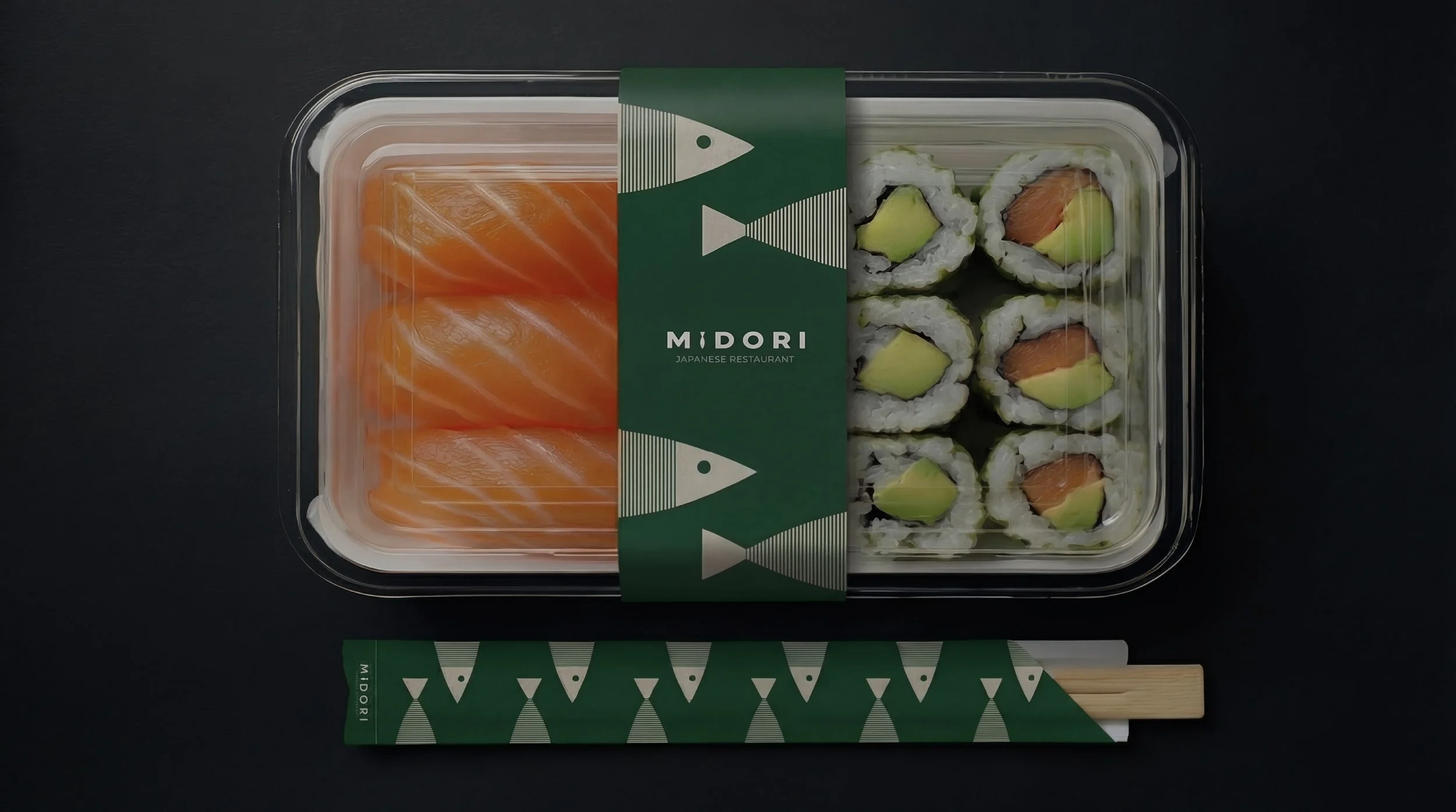
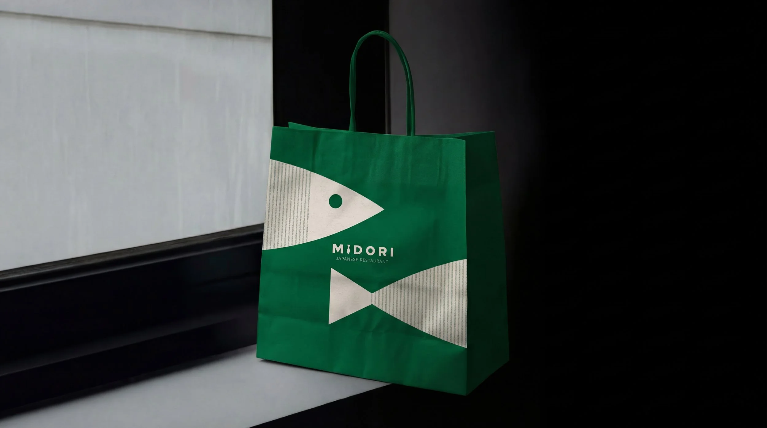
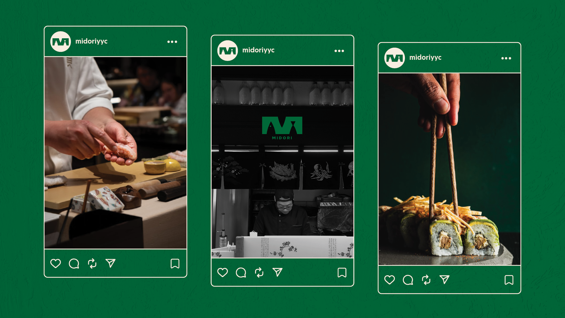
Midori, meaning 'Green' in Japanese, is a cozy neighborhood gem beloved by Calgary locals. Our studio reimagined this heritage brand, evolving beyond traditional Japanese restaurant aesthetics to reveal an identity defined by clarity and freshness. The goal was to create a modern atmosphere where the visual brand finally aligns with the high quality of the dining experience.
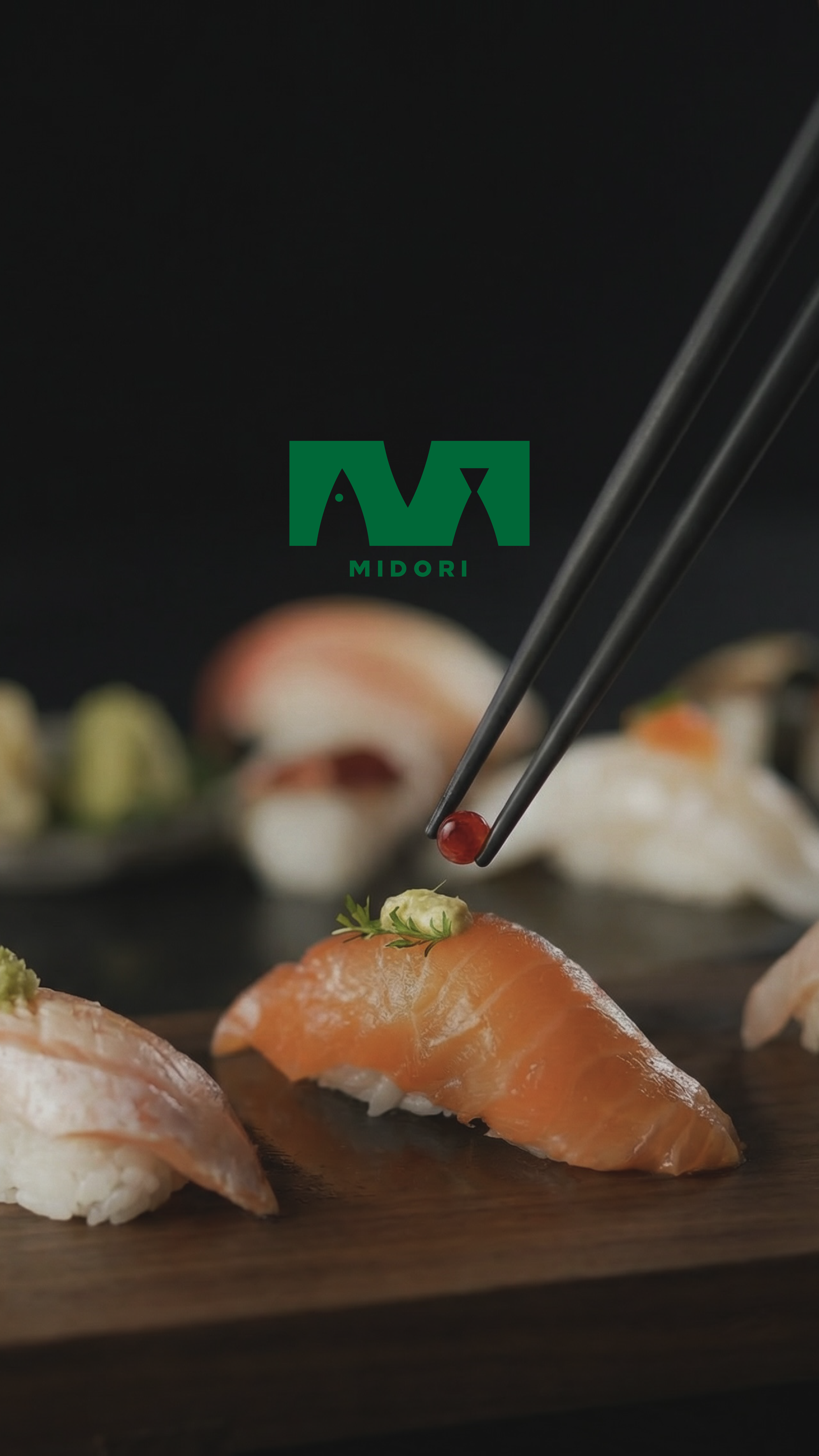
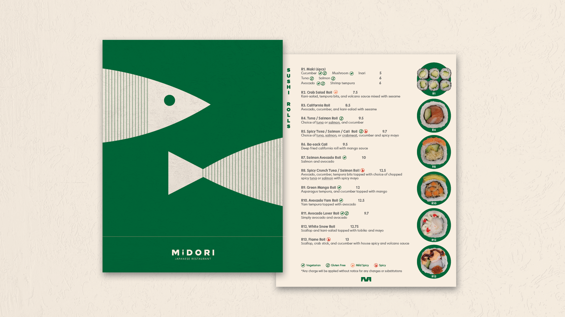
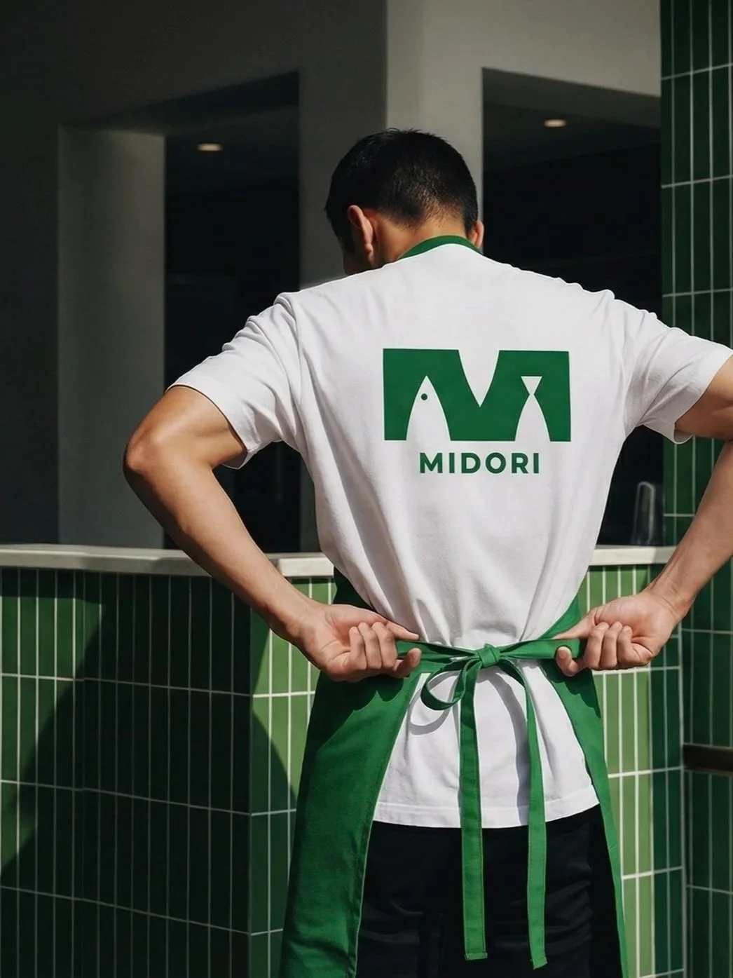
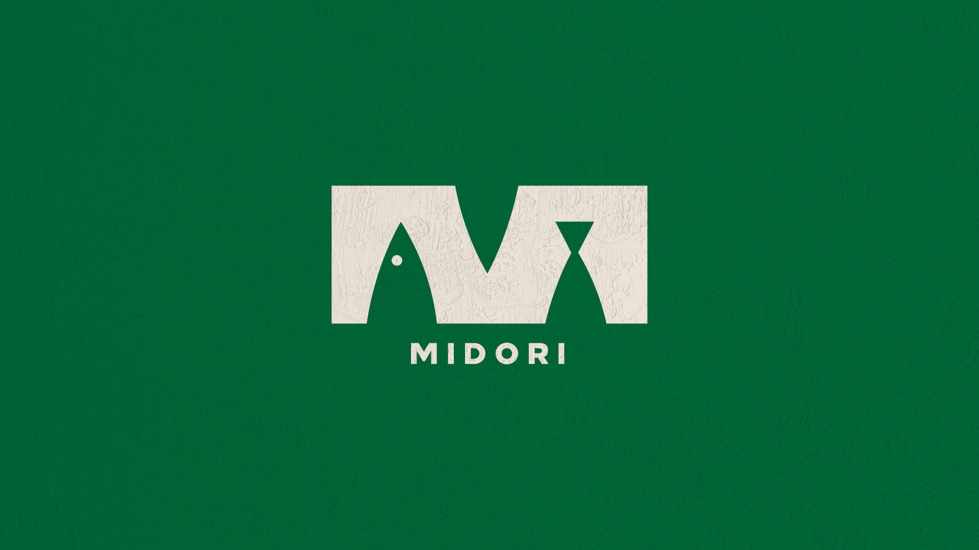
The redesigned logo features a versatile interpretation of the letter M. Its clever geometry acts as a double-entendre, capturing both the profile of a fish to symbolize their signature sushi and the silhouette of a sake bottle. This minimalist approach ensures the brand remains striking and legible across every touchpoint, from the menu layouts to the environmental graphics.
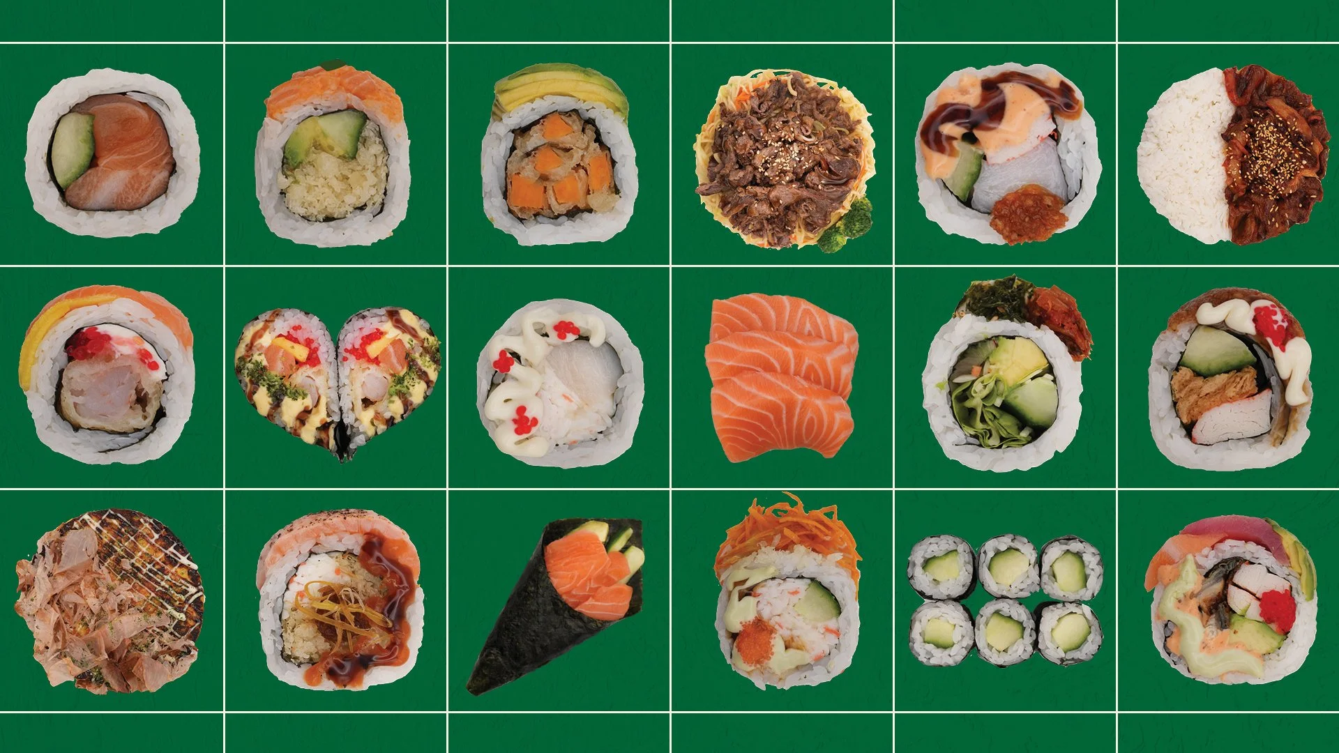
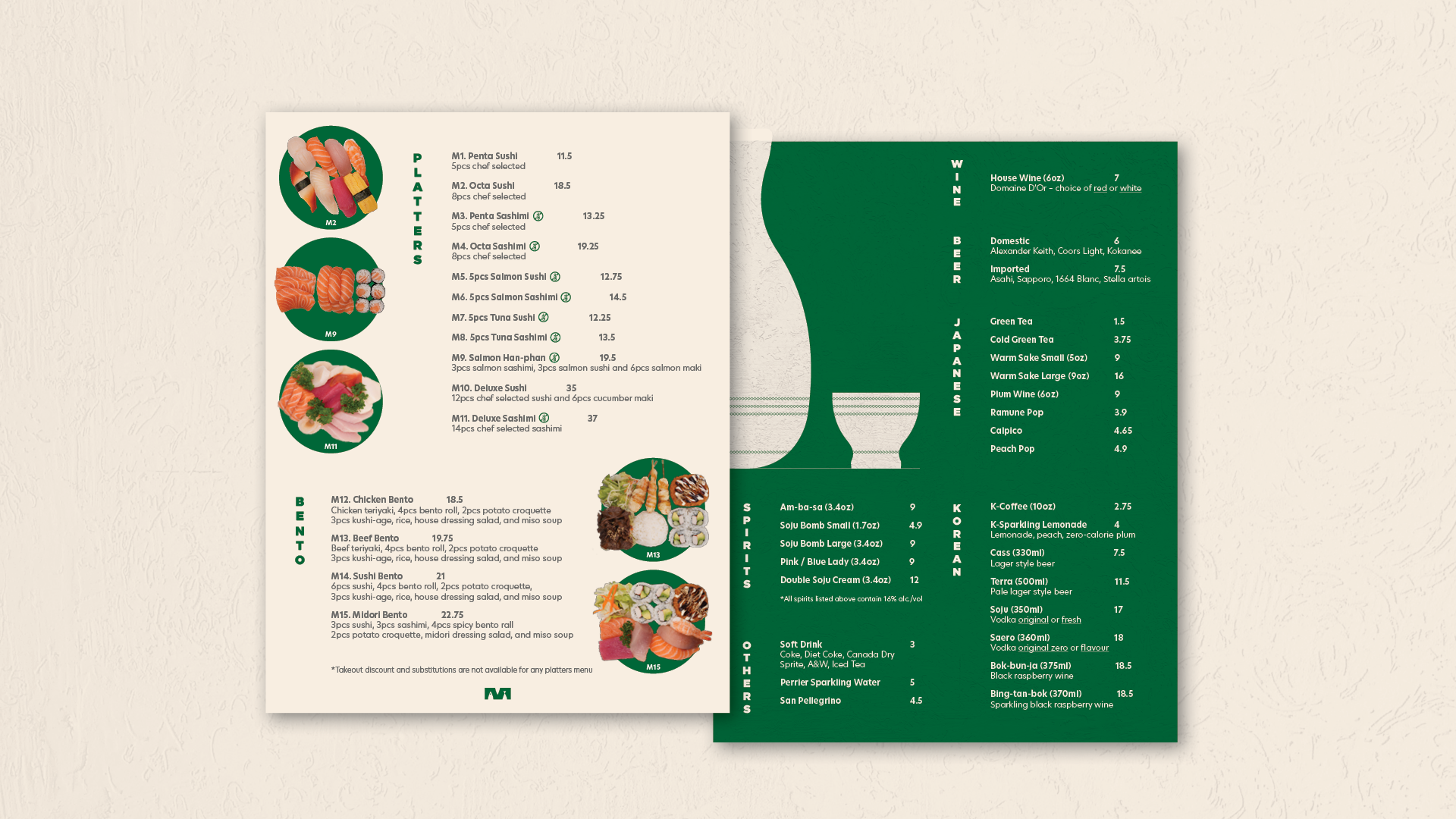
A significant portion of the project was dedicated to the menu, where we introduced a top-down photography style to showcase each dish with absolute transparency. By focusing on honest ingredients, we created a visual direction that is both aesthetically unified and deeply approachable. The new menu captures the warmth of the owner-chef and Midori’s cozy local vibe, transforming the selection process into an inviting, easy-to-read experience.
Midori